Soil Health Improvement Tool
A decision assistance tool for farmers to determine which farming practices they wanted to change and for their fields, and estimate the financial impact.
DATE
2022 - 2023
ROLE
Lead UX designer focusing on the workflow design, user research, and visual design
COMPANY
Indigo Ag, Inc.
EXECUTIVE SUMMARY
Converted 5 individual data-intensive prototypes into a single, combined experience with shared data to provide farming insights and profit estimates.
The target audience for this feature is American farmers, low-tech users, with ages ranging from 30’s-70’s.
-
I performed an evaluation of existing tools and other discovery research methods to determine the best direction for building this feature.
-
Early wireframes were tested with users, resulting in major updates to the navigation and information design.
-
I delivered final visual designs to development teams and launched this feature in August of 2022.
-
Once the tool was launched, I continued to gather user feedback at trade show events to inform our feature improvement roadmaps.
PROCESS: DEFINE THE PROBELM
Limitations of existing prototype tools
A soil science and agronomy (farm expert) team at Indigo developed with a series of prototyped tools that could calculate savings or earnings by comparing a farmer’s current activities with changes they were considering for each of these steps in the farming season.

A list of all prototype tools, and an example of the UI of one of the tools
These tools were created to represent a natural ecosystem where data from one would impact or build upon another. The problem with these tools were that they were made in prototyping software that couldn’t store data, and they were all built independently and couldn’t share data with each other. So my focus for this project was to turn these into one complete software feature that fit into the company website.

How the data of these tools is intended to flow

Prototypes are prevented from sharing data in the current form
PROCESS: DISCOVERY RESEARCH
Evaluation of existing tools
The science and agronomy team spent a lot of time making these prototype tools so I wanted to maintain the core function of the tools. I started by evaluating the tools and noticed they all followed a similar pattern, a user entered a series of inputsand the tool provided a result. From this I was able to develop a simple template flow that worked for each of the tools.

How the data of these tools is intended to flow
Framework to standardize usability of the tools
Following a template to build these would provide consistency for a user going through each of the tools, as well as efficiency for the engineering teams building it.

Template created to standardize the interaction flow
Putting the tools together
After my initial evaluations of the tool workflows, I needed a way for them to exist together on one page that a user could easily see all of them and interact with them as desired. I came up with a summary page concept combining all tools on one page, and included access to launch the template flow for each individual tool.

Sketch of summary page with tool launching points
PROCESS: DISCOVERY RESEARCH
What are users doing today?
I visited with farmers to learn how they kept track of plans for their fields and finances for a crop season. From this I learned what the user valued seeing most when referencing his yearly plan: a high-level table summary and bird’s eye view of each field he is planing for.

Understanding the science behind the tools
I held brainstorming sessions with our science team to understand the biology of the system and the impact that certain variables has on one another. This helped me to understand the order in which the user needed to flow through these tools to best align with the science process.


PROCESS: INITIAL CONCEPTS
Bringing the concepts together
Based on my background research I determined the summary page needed to also include:
-
Launching points into each of the tools to enter the template flow of each tool.
-
A table summary view of saved data after each of the tools are used.
-
Additional information that users typically reference like field maps and financial estimates.

Sketches of wireframes
Wireframes
I also created digital wireframe versions to get buy-in from key stakeholders.


PROCESS: USER TESTING
Held user testing sessions with initial concepts
I held 5 user testing sessions with farmers in various locations across the U.S.


Insights from testing and the changes made to address them:
-
Users were unsure of what to do with this feature and needed an intro to get them set up and oriented.
-
Once in the tool, users needed to be guided through the navigation of the steps to use each tool in the intended order.
-
Users wanted to focus on one topic at a time but the UI had all sections in the same view. The information architecture needed to be changed to give each topic would have their own pages.
-
The tool flow worked well, but users thought they went to a new page so a consistent navigation panel was needed to maintain context while in the “tool mode”.
PROCESS: VISUAL DESIGN
First time user experience
This initial step collects basic information to begin providing users with valuable insights right away and orient them to what the value of this feature is for them.

Navigation changes
This added navigation panel keeps users oriented while going through different pages, and also shows the order in which they are meant to move through each step.

PROCESS: USER VALIDATION
Guerrilla research sessions
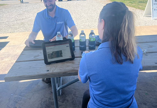
Attended a farm trade show where many potential users also attended, I loaded the feature onto an iPad and approached users throughout the day to test for 5-10 minutes and to get initial reactions and use insights.
